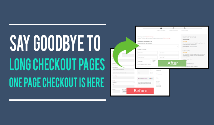
Say Goodbye to LONG Checkout Pages. One Page Checkout is Here!
For eCommerce sellers, shopping cart abandonment is a leading cause of missed sales opportunities. It represents a huge portion of your site traffic, and some estimations suggest up to 70% of customers abandon their carts before completing an order. Luckily, the ability to entice this segment of shoppers – who are so close to making a purchase – to actually go through with their order is simple. While 1 in 10 people who abandon their shopping cart do so because the checkout process is too long or complex, the fix is an easy one. It’s called the one page checkout.
What’s Wrong with Long Checkouts?
When shoppers put items into their cart, they’re in a buying mood. It doesn’t take much to push them out of that frame of mind, however. In today’s fast-paced digital age, having to set up an account, enter shipping information, then fill out payment fields – all on separate pages – feels like a tedious process. Worse yet, if your site is slow or load times climb higher than a couple of seconds, you’re even more likely to drive customers away.
For more than a third of shoppers (35%), creating an account seems like too much of a hassle and will cause them to leave. While some shoppers may indeed want to set up an account with you, this should be presented as an option, or something that can be completed at a later time. For shoppers who are ready to make a purchase, the sole focus is on checking out as seamlessly and quickly as possible.
Moreover, data security remains a concern at the forefront of your customers’ minds. With the prevalence of hacks data leaks, it’s no surprise that 81% of consumers feel as if they’ve lost control over how their personal data is collected. Simplifying the checkout process and requesting only the minimum required information from your customers is a good way to build trust.
The Most Important Page in Your eCommerce Funnel
Many carts are abandoned before they even get to the checkout page. Yet, of those that do make it to checkout, half are abandoned at this critical stage. This makes your checkout page the most important one in your entire eCommerce funnel. After all, the checkout page is where the sale is made.
What is a One Page Checkout?
A one page checkout allows consumers to complete their order without ever having to leave the page. It provides a quick and easy way for users to finalize their purchase in as few clicks as possible. Reducing friction and increasing checkout speed are paramount in the success of any eCommerce checkout, and are the very features that your shoppers expect.
Not only are one page checkouts simpler, they are also better for establishing brand credibility. If you have a lengthy checkout process that seems to be asking a few too many questions, it can drive consumers away quickly. Likewise, any time the page appears to be a little “off,” shoppers will consider it a red flag, and likely leave without ever returning.
The Challenges of One-Page Checkout
While creating a one-age checkout is the obvious solution for boosting conversion, many eCommerce store owners simply don’t have the resources to create one. Creating a new checkout page for all of your products can be tedious and time-consuming, especially for sellers with extensive inventories. Plus, the checkout page has to be aesthetically appealing: it should be simple and straightforward, while still providing all of the information your shoppers might need to know. Plus, it should also provide a flawless mobile experience: mobile devices now make up more than halfof all eCommerce traffic.
With so many requirements to think about, many eCommerce retailers wind up hiring developers. Yet, designing visually appealing, high converting checkout pages shouldn’t cost a fortune – or take up a good portion of your time.
Handsome Checkout
Our tool, Handsome Checkout, allows you to optimize the most important page in your eCommerce funnel, giving you the option to turn any page into a sales page by embedding a WooCommerce checkout form. This gives your shoppers the power to instantly and conveniently make a purchase, without having to click through any extra pages or input more information than what’s needed. Best of all, Handsome Checkout offers a multi-product template so you can create checkout pages in seconds. With flexible options such as “skip cart” and “buy now” add-on features, you can simplify checkout even further. Offering tremendous time savings for sellers and shoppers alike, this innovative tool is a win-win that can completely transform your site’s user experience.

