5 Easy Steps to Optimize Your eCommerce Checkout Page
Optimizing your eCommerce checkout page to increase sales is essential but there’s another little secret that no one ever talks about. It’s also never ending!
Here’s what I mean…
Once you find something that gives your sales a boost the temptation is to dust off your hands and relax.
Huge mistake! Sure, enjoy it for a little bit but then you need to move on to your next goal. And that goal is to beat the boost.
IF you boosted sales by 2%, your new goal is to boost them by another 2%…or more! To help you with this I put together five ways you can optimize your eCommerce page for conversions.
Step 1. Do not Force the Registration or Account Creation Process
As a customer, you would like to buy a product or service easily, quickly and securely, while as a marketer you would like to close a sale and collect all the valuable customer data to sell or market more products.
The problem that many site owners do not recognize is that the collection of consumer data is often done at the initial stage within the checkout process, by requesting potential customers to register or create an account prior to the completion of their purchase, hindering the checkout process as a result. And research suggests that this is the primary reason for cart abandonment. Customers visit your site to make quick purchases, and not necessarily build long-term relationships with your brand; therefore, avoid forcing them to create an account.
Step 2. Ensure your Checkout Area is Self-Contained or Isolated
When a customer reaches your checkout area, it is crucial to keep them there by lowering the quantity of unnecessary information. Do not bombard them with irrelevant information, believe us you do not need a disgruntled customer. The best thing you can do is take your customers to your website’s order confirmation page easily and quickly, while minimizing distractions.
It will be a win/win situation. Find ways to make your customers stay on the checkout page by making it easier to locate pertinent information and help. See 3 tips to improve shopping cart page
Step 3. Create a Short and Stepped Checkout Process
Figure out all the information you require from your customers. Usually this includes a few personal details such as full address, billing information or payment information. Many retailers also have to accommodate vouchers or gift card information. It is important to ensure that you gather relevant information, and as a result, keep the steps within the checkout process to a minimum. It is also vital to let your customers know exactly where they are within the checkout process.
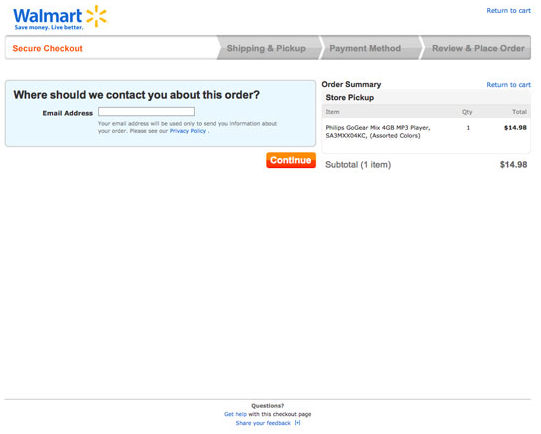
For example, Walmart does this expertly. It has a stepped and isolated process which shows customers where they are, making the process neat, snappy and convenient.

Figure 1 Walmart Checkout Page
Step 4. Make it Easier to Fill Forms
This can be achieved through good design practices. There are various standards relating to web forms that you must implement on the checkout page. Some of them include:
- Use of asterisks for all the mandatory fields
- Use of drop down menu when there is a list of different options (such as titles and country names)
- Use of radio buttons in case there are fewer options
It is also vital to pay attention to your form design. For example, field size should ideally reflect the information you are expecting your users to input, while field labels must be correctly aligned.
Step 5. Have Shipping or Delivery Costs Upfront
Believe me customers do not likes unexpected surprises, especially in the form of higher-than-expected shipping costs. Always keep in mind that there is nothing quite as frustrating as completing an extensive four-page form only to find out that delivery costs are not what you expected. This is likely to lead to customers abandoning the cart and exiting your checkout page half way through the process.
In addition, it will leave them disgruntled and dissatisfied, portraying your company and brand in a negative light.
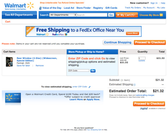
This is why it is important to tell your consumers as early as possible what the shipping or delivery cost will be. This is applicable even in cases where the delivery costs are not fixed or vary depending on the customers’ location. Again, Walmart does this by informing its customers about the delivery charges before they even enter the checkout stage (this is shown in Figure 2).

Figure 2 Shipping Costs Clearly Displayed

