Best One Page Checkout Solution for WooCommerce
Did you know that marketing doesn’t have to be complicated?
I know, I know. There are a lot of businesses out there who need you to THINK it’s complicated so you’ll buy their stuff.
And truth be told, their way of setting up a million different funnels and upsells and tripwires and split tests can and does work for some people. But it’s also expensive to do complicated.
You have to buy expensive software and then get the training on how to use all this stuff.
I prefer simple.
Simple is understanding your customer’s problem better than they do and showing them how to solve it with your solution.
Doesn’t matter if you sell clothing, jewelry, supplements, whatever. The simple formula above is universal and works in any niche.
So if you want complicated, that’s your call. You can complicate what I’m about to show you and it will still work for you.
Because I want to show you how to simplify THE most important process in your business. The Checkout Process!
This is where the money comes in. Nothing happens if you don’t have a way for customers to checkout.
And one of the easiest ways to simplify this process is to use a One Page Checkout Solution inside WooCommerce.
Let me walk you through it.
Easy 1 Page Checkout Solution
Setting up a one page checkout for your WooCommerce store doesn’t have to be difficult.
I’m going to cover two simple , but different, methods you can start using a one page checkout. This will be based on two different use cases.
Use Case 1 – You run a traditional WooCommerce store with several different products
If this describes your situation, that’s great. Because you can actually use both methods in this article.
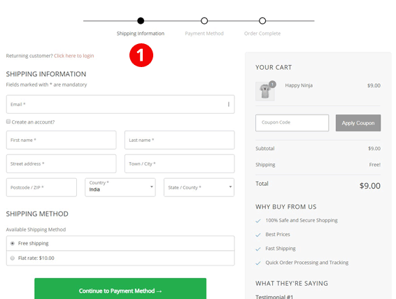
When we’re talking about a “traditional” store we’re really saying that a customer comes to our store, adds items to their cart then checks out. The simplest method for setting up a one page checkout is to use a layout like the one below:
There are a few things going on with this particular design that makes it stand head and shoulders above everything else. This is one of the templates inside Handsome Checkout.
Take a look:
Testimonials are front and center. Testimonials show your customers that what you’re selling actually works. Testimonials are PROOF!
Two Step checkout process. This layout captures your customers personal information first and then asks them to make a micro-commitment to go to step 2. On step 2 they will enter their payment info. Separating these two actions makes the decision making process easier for your customer. If they complete step 1, they WANT to complete step 2 to close the loop.
Order Bumps let you offer an upsell before the purchase is complete. The Order Bump doesn’t appear until step 2 and that’s good. You want to make step 1 as easy as possible. Here’s what the Order Bump looks like:

Cart items and quantity are on display. Letting your customers see exactly what is in their cart throughout the checkout process is a simple way to remind them what they’re buying. And if you enable the variation and quantity feature on this particular template, your customers can make changes to the items in their cart.
Now, let’s move on to the second use case.
Use Case 2 – You sell single products or product bundles through individual sales pages.
One of the things you’ll discover about WooCommerce, if it’s new to you, is how versatile it is. Sure you can run an eCommerce store but you can also use it for more traditional marketing promotions that just sell a single product, course or other offer.
For example, let’s say you are selling an online course.
You would create your sales page and then drive traffic to this page through email marketing and possibly paid ads. You might even be using joint venture partners.
To set up a single checkout experience, you can actually embed your WooCommerce checkout form throughout your sales page. And this embedded form can either be a two step or one step.
Here’s what a two step form looks like:

In this screenshot above you’ll notice that the checkout form is near the top of the page right next to the demo video.
This is taken from a live front end offer which is typically sold at a low price point to acquire a customer. But if you’re selling an online course, it could be a higher priced, in which case you probably want to move the checkout form further down the page.
If you can embed a YouTube video you can embed a WooCommerce checkout form. So moving it to another spot on the sales page is as simple as copying the embed code and pasting it anywhere on the page.
This is another feature inside Handsome Checkout.
And like the traditional layout above, you still get the option to add an Order Bump inside the embedded form.
Putting Your One Page Checkout Solution Together
So here’s how you put this all together.
Option 1: If you fall into Use Case 1, you can get started by installing Handsome Checkout, selecting the Multi-Product template above and then use it as your default checkout page. And you can also start testing the method used in Use Case 2 to run promotions for individual products. You can literally use WooCommerce in an entirely new way.
Option 2: If you fall into Use Case 2, you’re probably really excited at this point. You’ve been used to paying hundreds of dollars every month to get the same features you can get for about 90% less than what you’re paying now.
And we didn’t even cover how much fun things get when you start adding in post purchase One Click Upsells for WooCommerce.
To get started with your One Page Checkout Solution for WooCommerce, take a look at Handsome Checkout today.

