Quick Checkout Plugin for WooCommerce that Actually Converts
When was the last time you were faced with an easy decision for your business?
It’s not a trick question. But it is an important one.
Here’s why I ask…
Business owners have to make hard decisions that most people will never face. And when an easy decision pops up, it sticks out because it’s different. It’s not the norm.
I’ve talked about the idea of decision fatigue in other articles. But today I want to give you a break from making hard decisions. Instead I want to show you something that will help you improve your conversions with little to no effort.
I’m going to show you tiny, easy conversion bumps you can make to your checkout page today.
See, over the last two years we’ve worked with THOUSANDS of eCommerce stores and helped them increase their sales.
And here’s the thing…
If we don’t increase sales, we don’t get to keep working with these stores. So what I’m about to show you isn’t theory. And you don’t even have to opt in for any of it.
You can take it, use it and never even work with us. So why would I do this?
Simple. Because what I’m about to show you is easy when you have the right plugin. The plugin setup that is super easy and quick. IF you want to do everything below on your own, go for it. But it won’t be easy…and if you’re cool with that so am I.
WooCommerce Checkout Page Conversion Components
I’m going to break down the components that every successful checkout page needs if you’re going to maximize your conversions.
Let’s get started.
Appealing Testimonials
The first component your checkout page needs is at least one testimonial. This can either be about a specific product or about how great your company is. But it needs to be on your checkout page and here’s why.
Testimonials prove to your customer that your solution works. See every customer is trying to solve a problem when they buy your product. Testimonials offer social proof that you can actually help them.
Order Bumps For Quick Conversions
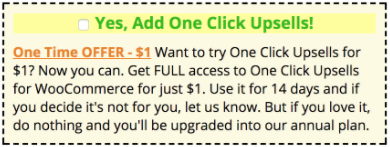
Adding an Order Bump to your checkout page is one of the easiest decisions you’ll ever make. Here’s what they look like up close:

Seriously, if you’re not using Order Bumps you are not making as much money as you could be. Order Bumps come from the old direct mail days. They’re a take on something called The Johnson Box – which is kind of a cool story. But I’ll have to tell it to you another time.
A lot of people get stuck on what to offer as an Order Bump and I get that. So we’ve generated a huge list of Order Bump Ideas to help you.
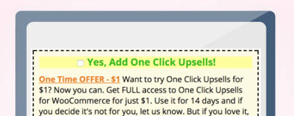
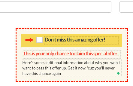
Now let me show you what an Order Bump looks like on an actual checkout page:
Example 1:

Example 2: This is using an embedded WooCommerce checkout form but you can still see how the Order Bump is displayed.

*NOTE: Inside Handsome Checkout, Order Bumps are standard on any checkout page and can be enabled with a click.
Super Easy Product Quantity and Variation Adjustments
Have you ever wondered if someone would buy TWO of the same product from you instead of just one?
The best way to test this on your checkout page is to make it easy for your customer to update the quantity directly on your checkout page. And if your products have variations (sizes, colors, etc…), it’s a good idea to allow customers to make those changes too.
Here’s an example of a checkout page with the option to adjust quantity. You’ll see we’ve also highlighted the quantity that is recommended. You can actually force this selection too.
Fastest Two Step Checkout Form
I’ve listed this component as a bonus because it’s a little different than the others.
The things we’ve just talked about will work across the board. A two step checkout form, though, is something that you at least want to test to see how it performs for you.
I like the two step because it breaks the checkout process down into tiny micro-commitments
For some of the stores we work with, the two step can’t be beat. For others, a simple one page checkout page wins every time.
We have a few theories on why that is but since they’re just theories, I’ll keep them to myself. I don’t want to give you information that isn’t fully tested because it could actually do more harm than good.
But let me show you some examples of a two step checkout form.
Here’s an embedded WooCommerce checkout form using two steps:
And here’s a two step checkout form using its own page:
Adding these components to your checkout is really easy if you have the right plugin.
We created Handsome Checkout to give you everything above and then some. It’s only $1 to get started.

